About
All-inclusive facility that combines many different areas of medicine. Some of services include family practice, women's health, walk in care, in-house lab services, and urgent care.
Goal
Initially, the client wanted to change only the design of the current website. The goal was to make it modern and user-friendly. Having examined the website, we also suggested changing the website structure a bit. Below is the design concept that we presented
Design
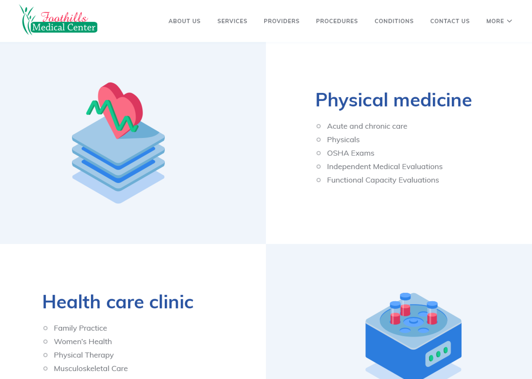
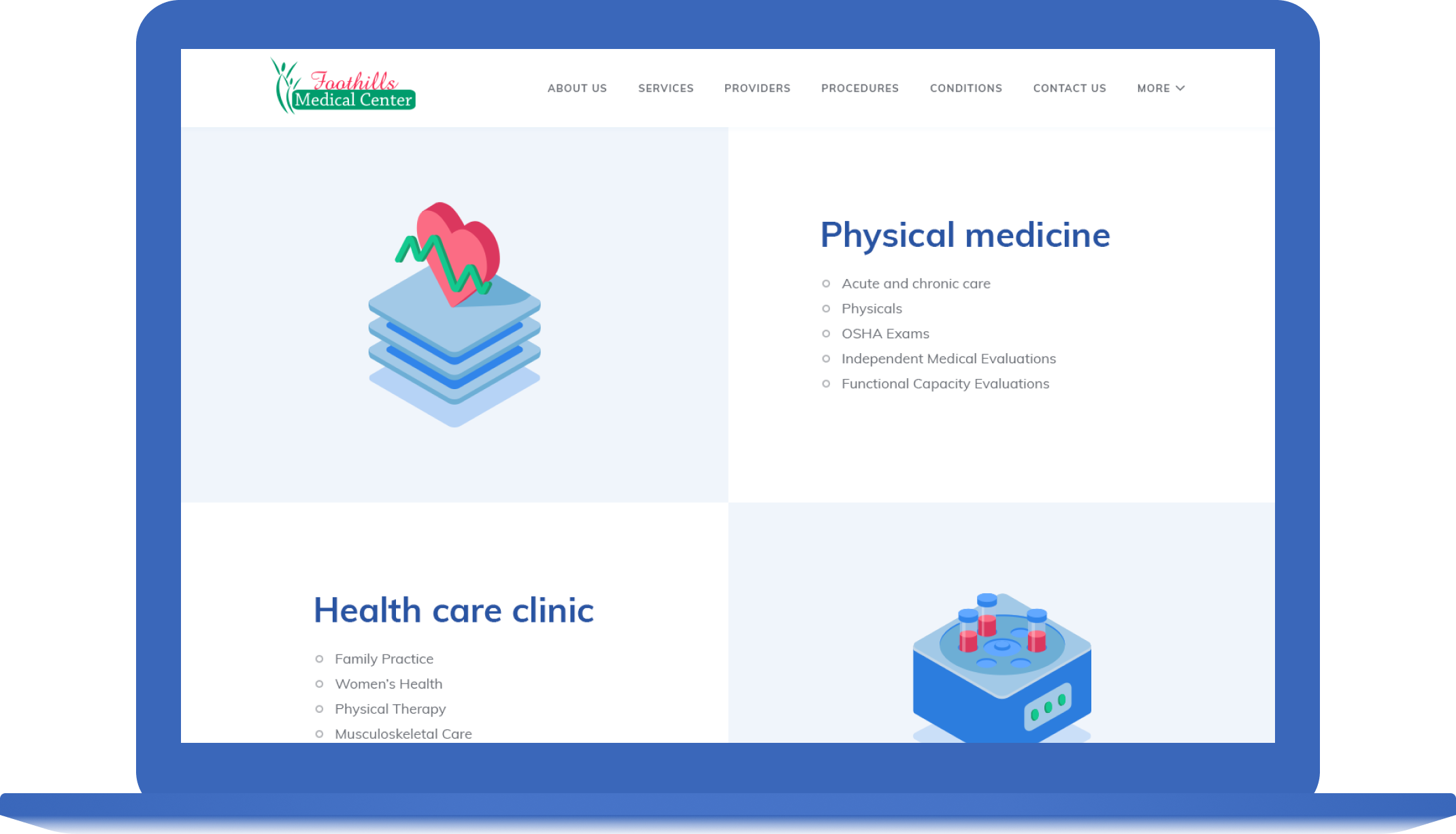
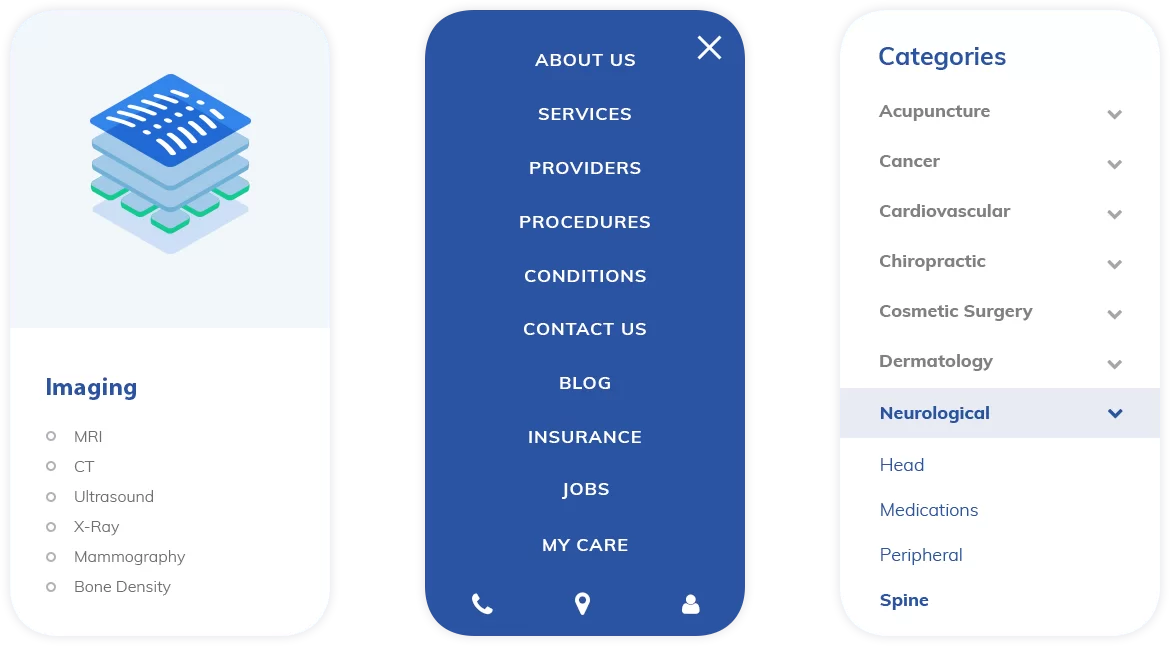
The works started with the structure reconsideration: we rebuilt the menu in the header and separated the “Procedures” category. The older website mixed the content on “Conditions” (symptoms of illnesses) and on “Procedures” (ways of treatment). Now these categories are divided.
We also played a little bit with the “More” button: when you hit it, it opens some kind of a drop-down submenu with more info about the Foothills Medical Center.

Illustrations
We decided to use illustrations to show the center’s specialization, basic services, and procedures. It’s an optimal visual solution for such sphere as healthcare.
- Illustrations are made in conformity with the website color palette and contain vivid color accents. It helps to draw a user’s attention and to make pages more eye catchy. Except a vivid red color, we added more calm green color into illustrations.
- We created minimalistic images to show center’s procedures. Pictures were made in the isometric style according to the modern trend in web design
- Illustrations help to show some specific medical instruments without unnecessary realistic details
Inner Pages
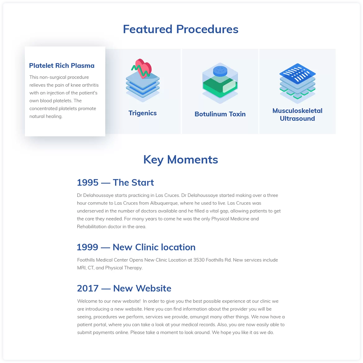
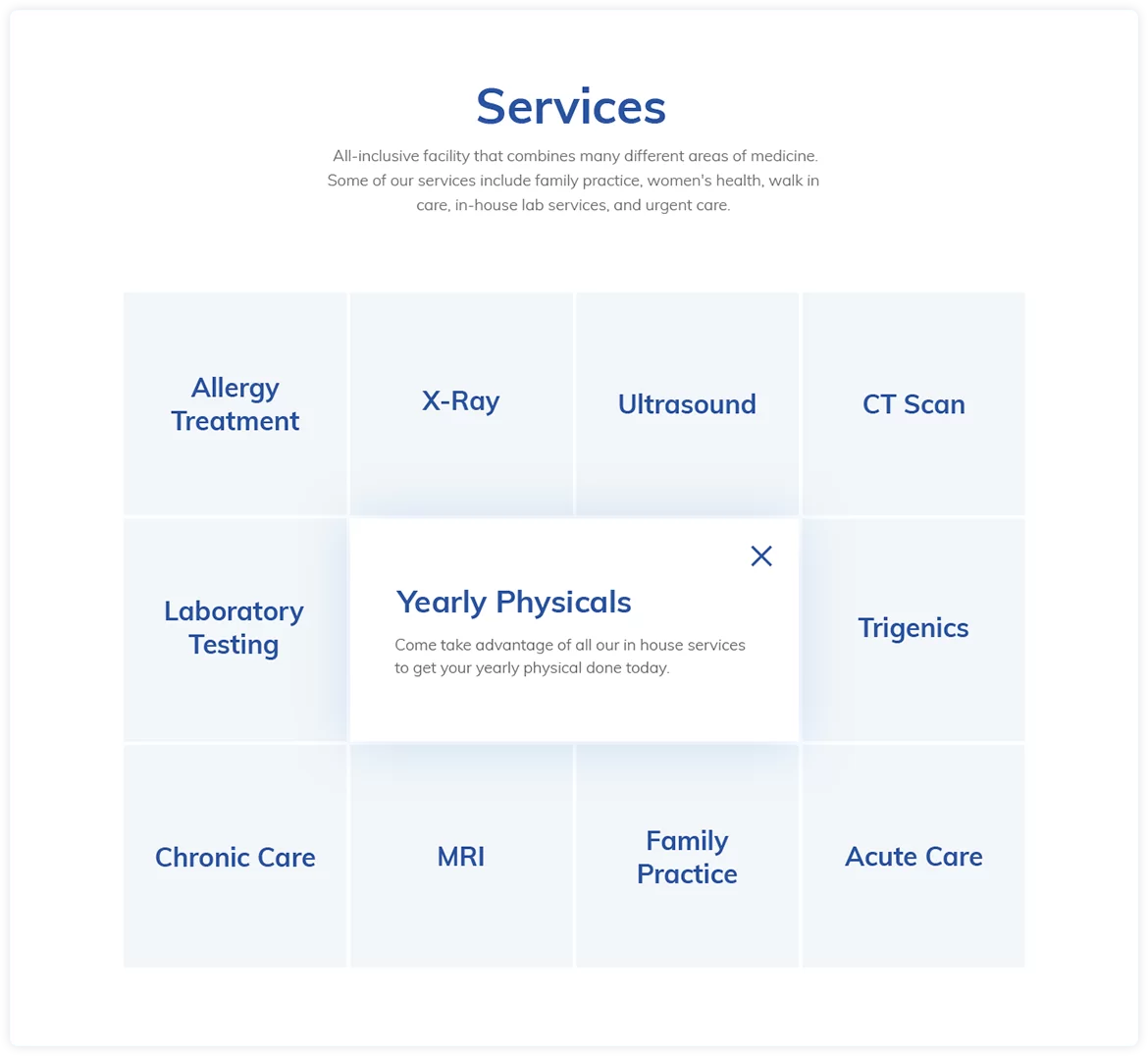
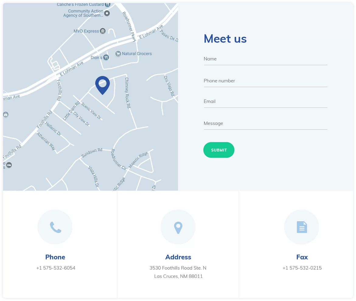
The website interface was created in compliance with the idea of a clean and bright look. We used mostly white and grey shadows with the addition of blue and green accents. The palette was developed according to the users’ associations with the healthcare sphere. The Inner pages appearance became more user-friendly due to “Procedures” and “Conditions” separation. Now it’s easier for a user to find a necessary information. This is very important - especially for healthcare - to provide a client with a correct data in an accessible way.
Mobile version
We made the design responsive, and now it looks good across all kinds of devices. The mobile version became more user-friendly, too. Thanks to the new structure, this version provides a quick access to the website content.
Conclusion
We especially liked this project because it was considered to be used in Drupal which is perfect for healthcare: it easily bears with a lot of content, it’s fast, and even a complex website can be run by a non-programmer - that is what our client needs. And the possibility to decouple Drupal and use the most modern technologies make it even better. Request our free consultation if you want to find out more about web development opportunities.

Anton Shubkin

Artyom Zenkovets

