

In the first post of this series, we talked about the importance and profitability of the online retail segment. Today, we’re going to provide you with seven essential tips on ecommerce user experience and making an online store, giving your buyers the confidence to click the Pay button and increasing sales in your online store.
Making an online store
If you boil down any requirements specification for an ecommerce store to the essence of the user’s action, it sounds like “find and buy”. It’s up to designers, developers, and analysts to decide how this will come to life. Adapting pages to specific search engines, placing buttons of correct sizes and colors, informing about promotional offers to increase sales, creating two-three-five carts, each important in its way, — aren’t these things the secrets lying behind the art of sales nowadays?
How to create an online store. Part 1
Ecommerce store homepage
A visitor who comes to the homepage of your ecommerce store gets a multi-tool where knives, pliers, scissors, and screwdrivers are replaced with a search box and buying tools.
Header
A website header consists of a search box, product categories opening on hover or click, language selection, clickable telephone number, shop addresses, user’s personal account, their favorites, and the indispensable shopping cart in the right upper corner that we’ll talk about below.
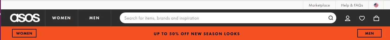
Source: https://www.asos.com/
Asos is minimalistic: the categories only include men’s and women’s wear. On the other hand, the search field prompts what you can find.
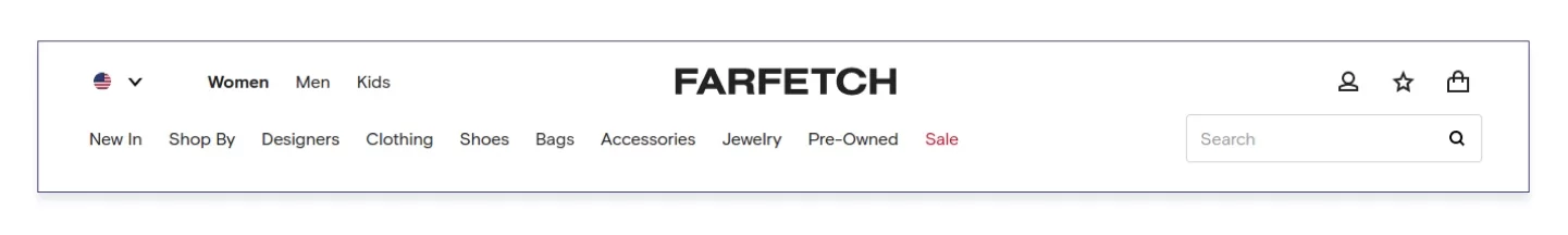
Source: https://www.farfetch.com/
Farfetch suggests digging into the product categories right away — even the search box is squeezed into its place.
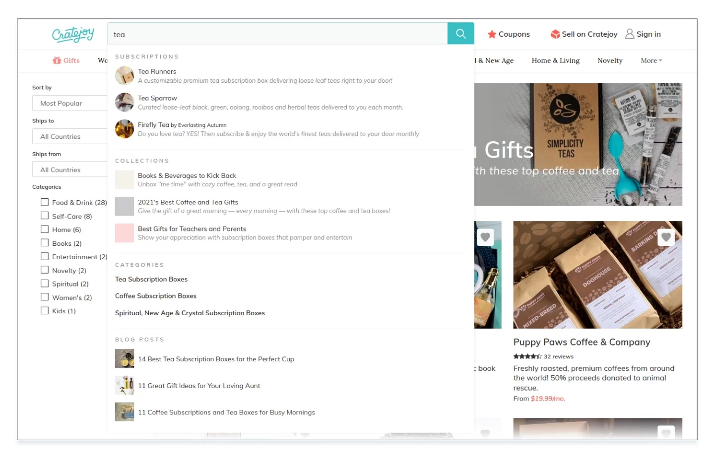
Source: https://www.cratejoy.com/
The search on Cratejoy, a shop of gift boxes, returns search results in several sections at once: subscriptions, collections, categories, and even blog posts.
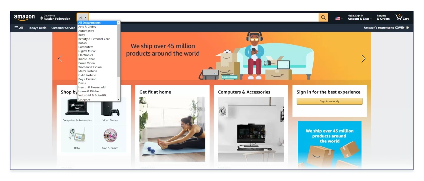
Source: https://www.amazon.com/
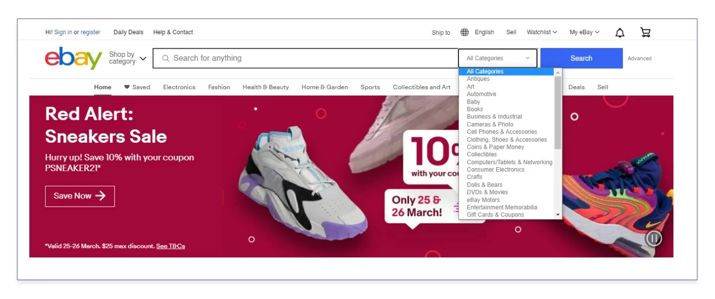
Source: https://www.ebay.com
eBay and Amazon, the pioneers of online shopping, suggest selecting the relevant category from the drop-down menu and looking for the product only within this category.
Product categories and catalog
The catalog may be stretched along the header or be vertical and hidden in the burger menu.
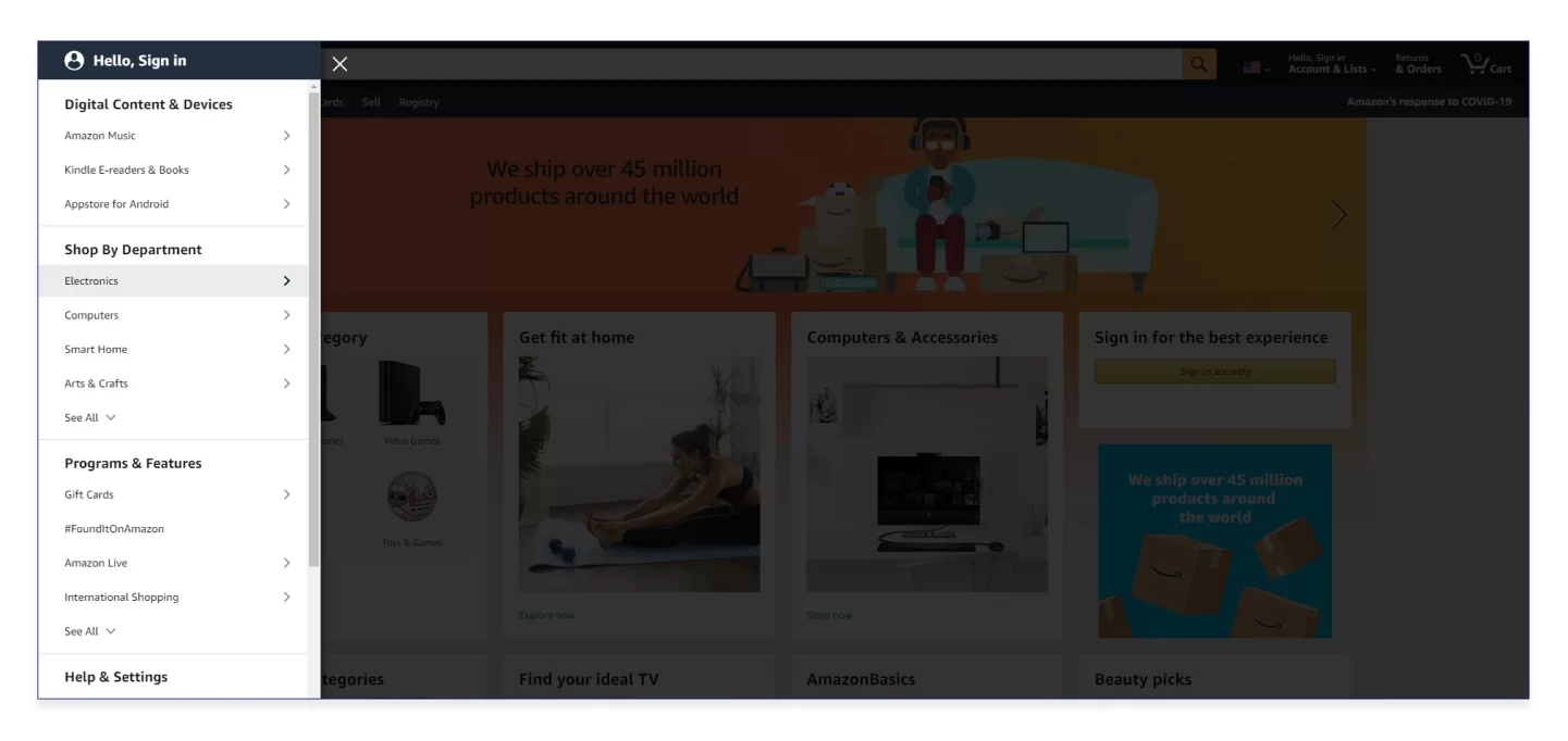
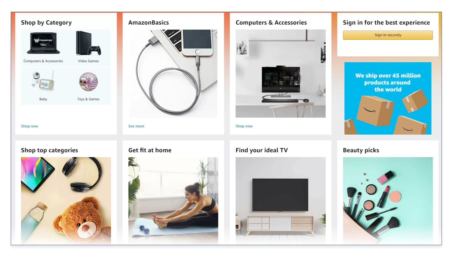
Source: https://www.amazon.com/
Amazon hides its vertical catalog in the burger.
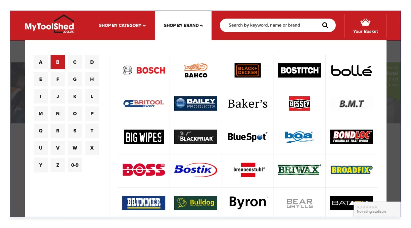
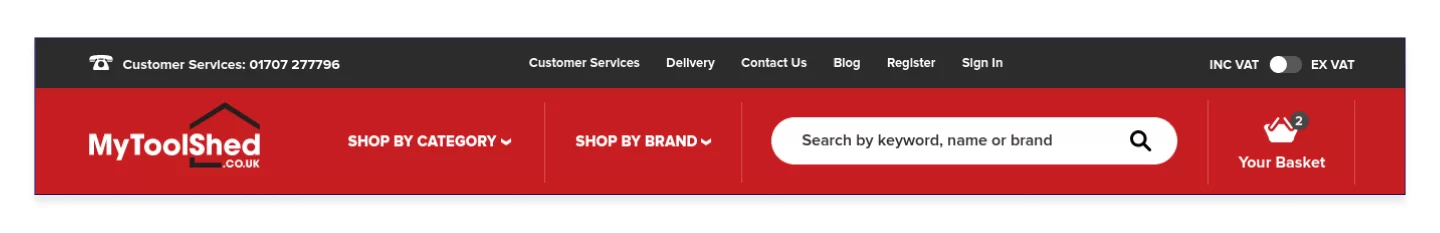
Source: https://www.mytoolshed.co.uk/
The tool shop has taken into account its customers' potential interest in specific manufacturers, so it offers searching by brands with an alphabetical index.
Promo materials
These ones are intended both for loyal customers and new buyers looking for reasons to like you. Promos include advertising banners in the header, product blocks with generalized headings (“New”, “Product of the Month”, “Editor's Choice”), special offers, and discounts.
Source: https://www.amazon.com/
Here is a typical promotion block on Amazon.
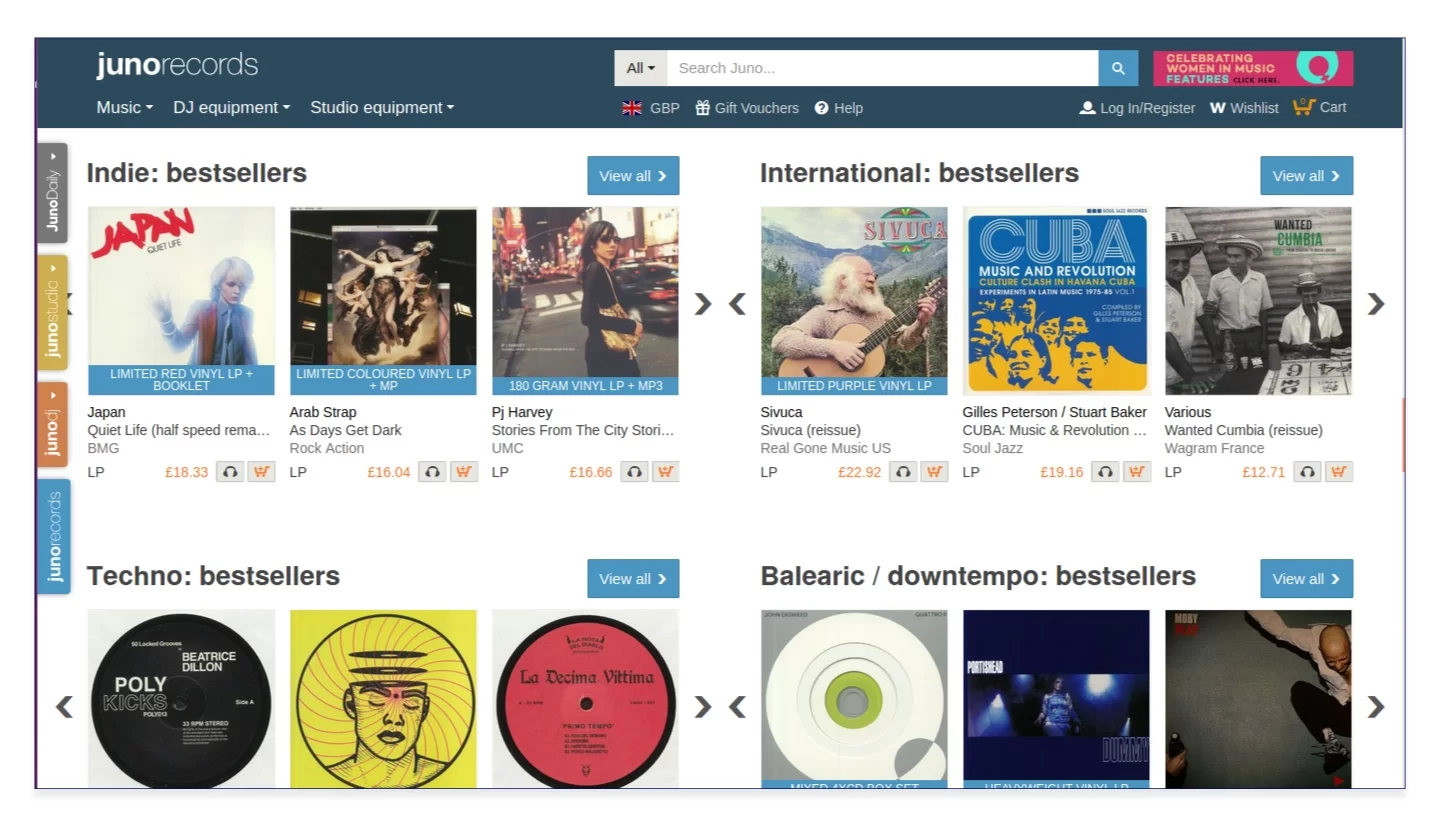
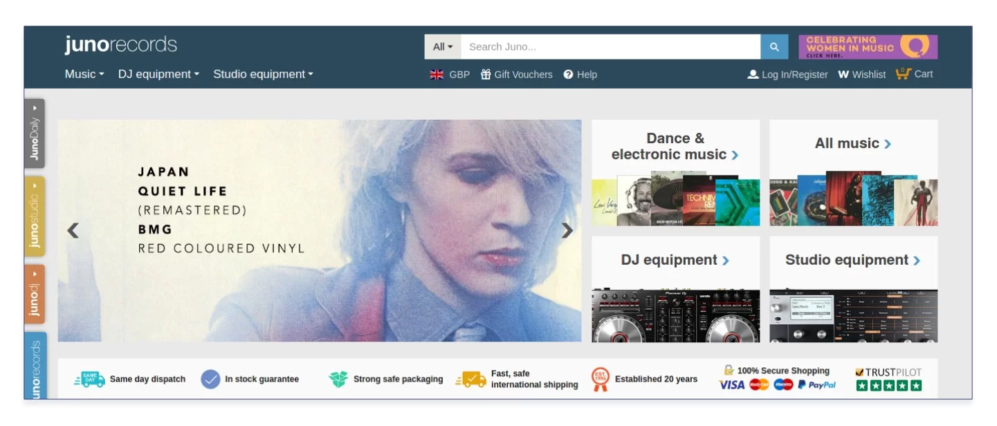
Source: https://www.juno.co.uk/
There is a large variety of music in the world. The editors of Juno, a shop of musical and DJ products, sort music records by styles and genres and place items they believe to be most important in promo blocks on the main page.
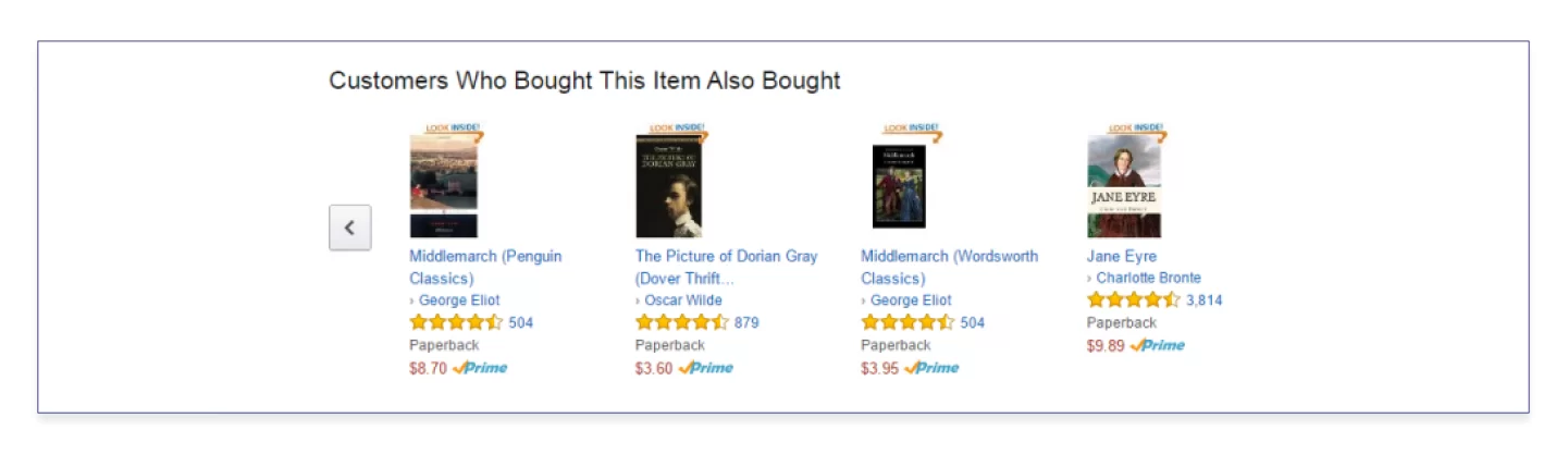
Source: https://www.woocommerce.com
Amazon analyzes shopping histories of those who had previously bought the product you selected and creates a block of personal recommendations. This is data analytics at work.
Banners of two types exist: static and slider-type banners. Sliders can be scrolled in two modes, manually or automatically. Though the automatic slider scrolling is criticized, some sources recommend setting the banner change rate to 5-7 seconds on the admin panel of your ecommerce store.
Source: https://www.amazon.com/
The banner change rate on Amazon is about 5 seconds. Though this is the optimal time, people may need a different amount of time to read the offer, that’s why you should enable pausing the banner by hovering the mouse over it.
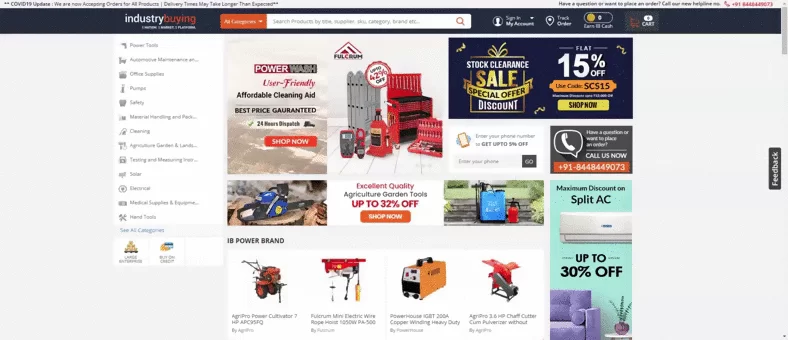
Source: https://www.amazon.com/
A negative example. The banners on industrybuying.com, a tool online store, change automatically every 2-3 seconds, so you don’t have enough time to read the offer.
Loyalty improvement solutions
Gain your customers’ trust by using positive reviews and official documents. Keep track of the recency of the reviews, as reviews three or more months old are less credible.
Source: https://www.juno.co.uk/
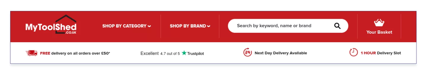
Source: https://www.mytoolshed.co.uk/
The headers of Juno and MyToolShed assure buyers of the service quality: the average score on Trustpilot is close to five, next-day delivery and delivery slot selection are available. Everything is quick, reliable, safe, and tried over years of experience.
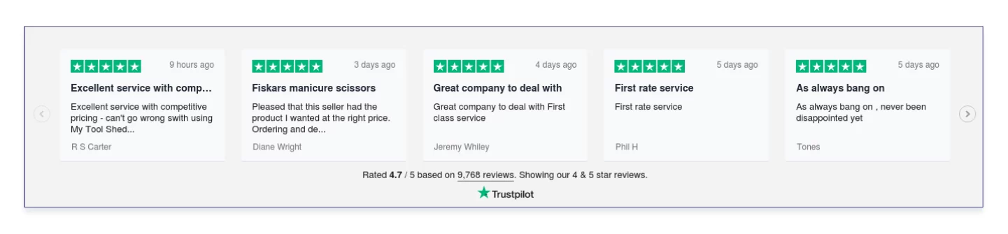
Source: https://www.mytoolshed.co.uk/
You can see what exactly people are saying about MyToolShed in the footer where designers inserted review snippets. Though the desire to show yourself in the most favorable light and publish only the best reviews is quite understandable, make sure that the reviews are real, and respond to negative reviews, which are unavoidable.
According to research, reviews of your products and services matter very much. If the first comment is negative, subsequent reviews won’t be very good as well, and this might go on for three years. 88% of customers give more credence to product reviews than to their friends, while 81% search for information about the product first and then decide whether or not to buy it.
Footer
The website footer partially inherits the items listed in the header and the menu but mainly contains the links to the pages with the company information and client service description, social media, mobile applications, terms of use and confidentiality policy, and also indicates the payment systems the retailer uses.
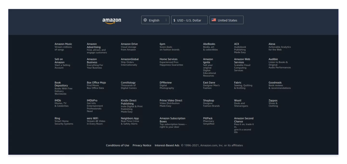
Source: https://www.amazon.com/
Amazon created a second footer to show their numerous partners as if one footer is not enough. The company hints that the lower part of the page is the space you can use as you like.
How to set up a store online. Part 2
Let buy in one click
In 2000, Amazon invented and patented the one-click purchase under the name of 1-Click. The intent was to allow the service to fill out all required fields with the information the buyer has already provided during the registration after the buyer clicks on the “Buy now with 1-Click” button. In 2017, the patent expired and the function became available on other websites.
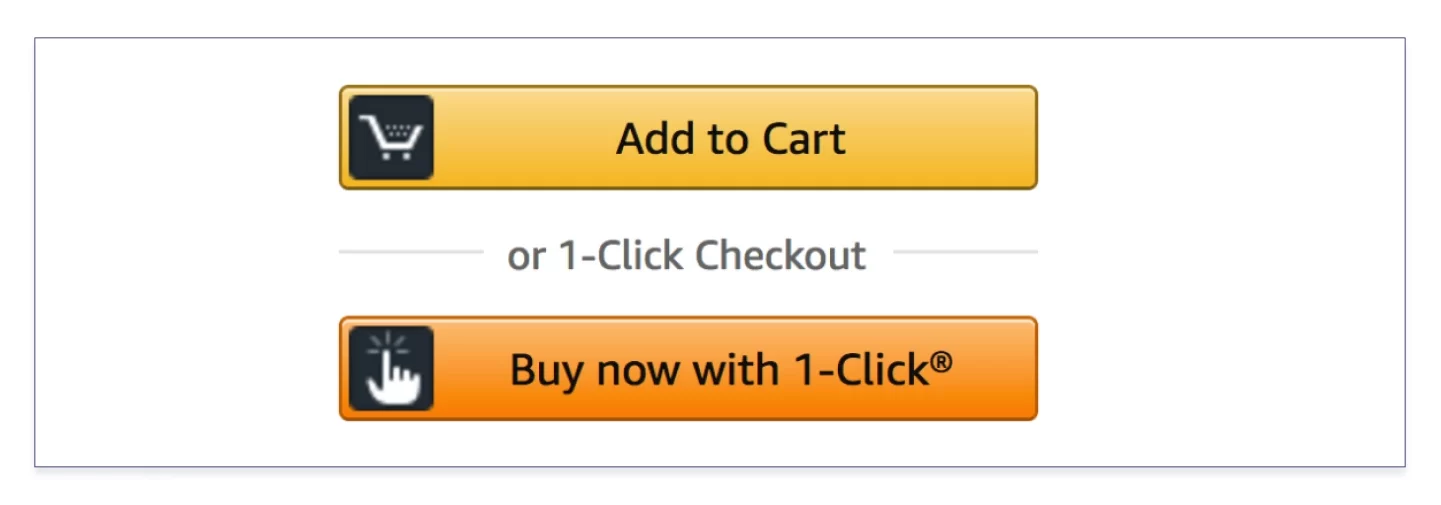
Source: https://www.amazon.com/
Today it has a broader meaning. In addition to jumping to the payment page, the function is designed to sell products to the site visitors who came to the ecommerce store for the first time and are not registered or those visitors who need only one specific product and wish to avoid the form-filling routine as they don’t plan to spend money here on a regular basis.
Availability of the function is a win-win for both parties as the user is requested to provide the phone number and discuss details of the order verbally with a manager instead of completing the form, while the shop makes a profit from such one-time purchases. And you should know that forecasts promise that 54% of all online purchases will be made on mobile devices, so requesting their owners to fill out tiny fields on the move is out of the question.
The best solution is to place the “One-Click Purchase” button near the “Add to Cart” button.
RELATED: How to Write User Stories
Do not underestimate offering this option to your customers. Such products as physical music records are rarely ordered by the piece (especially if the buyer is in another country and has to pay for the delivery), so it doesn’t make sense to look for the one-click button on the pages of juno.co.uk website when you buy an LP or CD. Nevertheless, they place the phone number on the equipment pages so that you could call the manager on your own, i.e. this is the same one-click purchase with the buyer acting as the initiator. It would be interesting to know what the website analytics has to say about using this function.
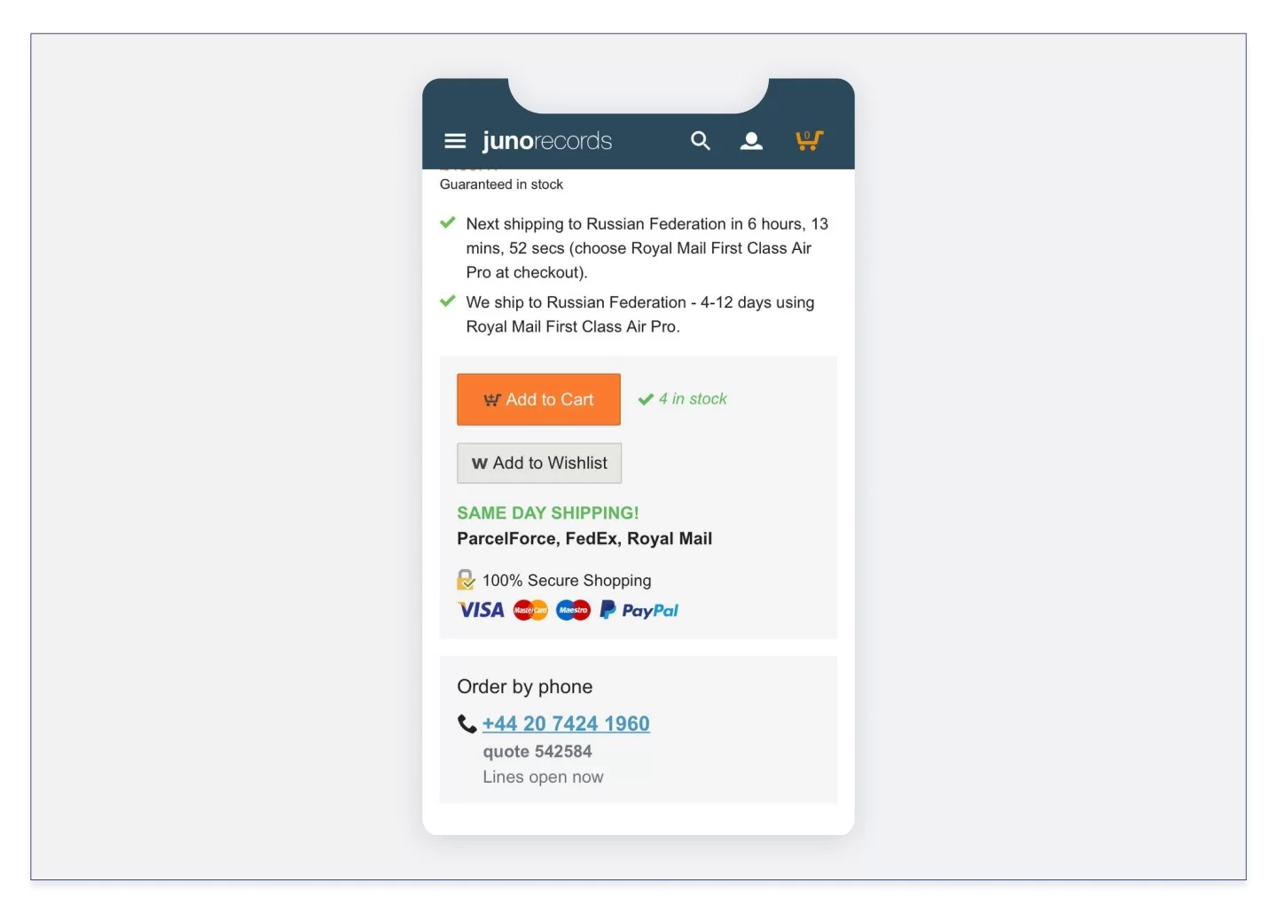
Source: https://www.juno.co.uk/
The one-click purchase has its drawbacks, too. One error in the telephone number will make the buyer wait for the manager’s call forever. On the other hand, in an attempt to unload its buyers, the shop is loading its personnel by forcing them to deal with the orders.
Today, one-click purchase modules are available in many CMSs. Since we at ADCI Solutions create online stores using Drupal, quick purchases on our clients’ website run on Drupal modules. For example, these are Commerce Express Checkout and Commerce Buy One Click modules.
How to start an ecommerce store. Part 3
Level up your search
The search is used by the most highly motivated buyers. It requires close attention from the shop’s marketing experts, more money infusions, and the best UI. The time and money investments won’t go to waste: the traffic created in the shop by those buyers who are looking for a specific product varies between 18 and 30%. According to the REES46 data, conversion of internal search queries into purchases generate up to 40% of additional profit for the ecommerce store. At the same time, poorly implemented search causes losses for the online shop. 8 out of 10 buyers leave the shop if they fail to find what they need in 8 seconds.
RELATED: How UX/UI design can help business
In recent years, there has been a particular interest in the faceted search. It allows narrowing down the search results and sieving through hundreds of products to find the product with a specific set of characteristics, say, a TV set of a definite brand with a specific type of display, screen size, and screen refresh rate.
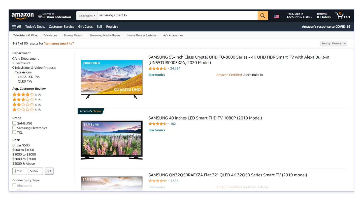
Source: https://www.amazon.com/
Amazon. We are looking for a Smart TV by Samsung. On the left, there are facets that suggest narrowing the search results. The page is dynamic, so if you tick off any facet, the search result will change automatically.
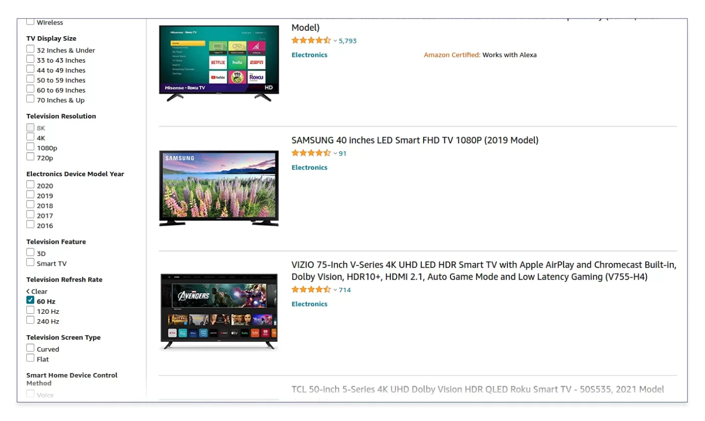
Source: https://www.amazon.com/
Let’s narrow the request down to the models with a screen refresh rate of 16 Hz only.
It looks like a filter-based search, doesn’t it? These types of searches have the same task, i.e. they must give what the buyer wants quickly, efficiently, and without the need to dig through product subcategories. Filters also do a great job on websites selling a small number of products with common characteristics. However, the more products there are and the wider the range of their features is, the more likely it is that the buyer will spend several minutes searching, which is an inexcusable time loss for an ecommerce business.
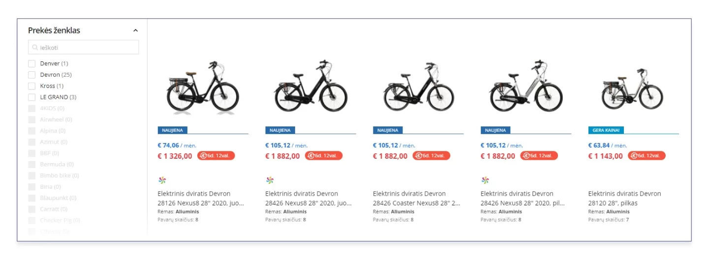
Source: https://pigu.lt/lt/
With the faceted search available on the Pigu.lt shop, a sudden occurrence of “0 products found” is ruled out because the designers just disabled the bicycle brands which don’t have the characteristics the buyer has specified.
The faceted search directly depends on the quantity and details of the product data. The more data is collected, processed, and taken into account when creating the facets, the higher the search speed and correctness will be. Don’t forget about the relevance of characteristics of the products, if your website sells products varying from beauty products to cars — a hand cream is not characterized by body style.
Search improvement has no limits. The improvement is inspired by the flexible functionality of such services as Solr: the ability to correct errors, understand transliteration, decipher requests written using an incorrect keyboard layout, and even read synonyms are the reasons why such search is justly called smart. We develop websites on Drupal and integrate Solr into the website using such modules as Search API Solr and Apache Solr Search. Solr is a fast search system with flexibly configured parameters that don’t load the server and simplify online shop scaling.
RELATED: How to create an ecommerce website with Drupal
How to set up an online store. Part 4
Let users compare the items
This is a standard scenario associated with the purchase of any product from food to home appliances and cars. If the product reviews don’t look credible enough, we cannot afford to buy the first laptop or refrigerator we come across, as the product range is too wide and we are interested in selecting the equipment meeting our needs. Since it is possible to compare two similar product types visually, it’s even easier to compare the products online than offline. All that is left to do is to present this function correctly. Let’s consider the examples of successful and unsuccessful implementation of this function by two ecommerce businesses.
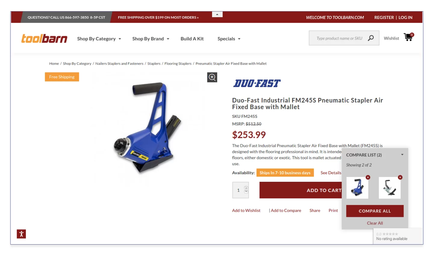
Source: http://toolbarn.co.uk/
The Add to Compare button on toolbarn.co.uk, a tool shop, is located under the Add to Cart button. The products selected for comparison are displayed in the widget in the lower right corner. Honestly, sometimes you have to scan the screen to find this widget because it’s far from the top of the product listing features hierarchy.
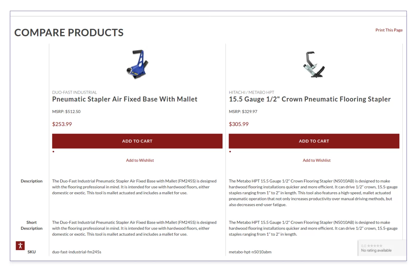
Source: http://toolbarn.co.uk/
Here is the product comparison page on toolbarn.co.uk.
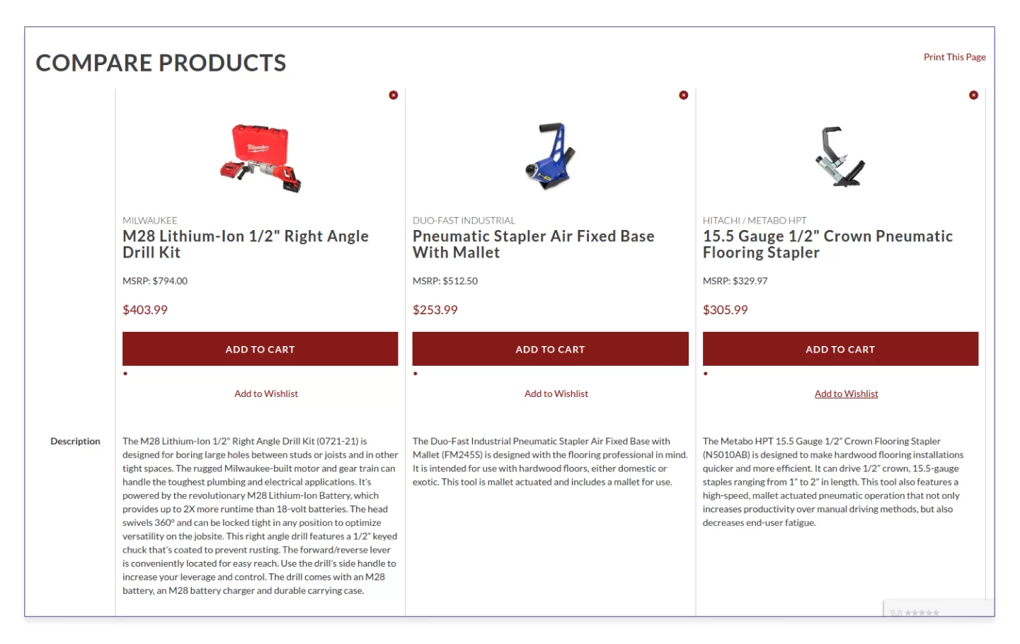
Source: http://toolbarn.co.uk/
Actually, it’s possible to compare several products from various categories. This is a bit confusing. What can be concluded from the comparison of, say, a drill and staple gun?
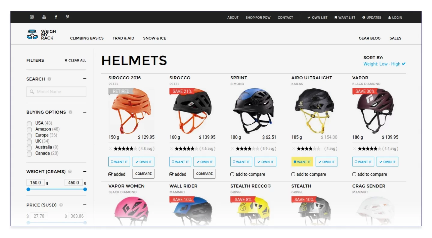
Here is a website used for comparing rock climbing gear — Weighmyrack — that ADCI Solutions supports. It won’t take much time to find the comparison feature as it is one of the main functions.
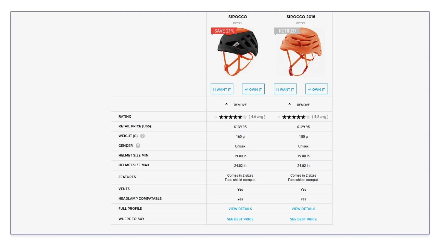
On Weighmyrack, it’s impossible to compare a helmet and a carabiner because there is no page that stores the products added for comparison. Everything is clear: you can only compare the products from one product group.
Decide for yourself how this or that function should be brought to life but, ideally, the solution should be based on the data obtained from the heat map, A/B testing, and other analytics tools.
How to make an online store. Part 5
Ecommerce shopping cart
This is the last milestone the buyer has to pass — and do this easily and gratefully. Buyers often drop their carts: in 2016, the losses amounted to 4.6 billion US dollars.
Source: https://www.mytoolshed.co.uk/
All online shops realized long ago that it’s not acceptable to distract buyers from shopping with the request to register. This is why they not only allow adding products to the cart right away but also save its contents after the browser tab is closed. Websites store cookies for this purpose, too.
Optimize your shopping cart for mobile devices. Remove all inessential items and make it convenient to pay from the mobile phone.
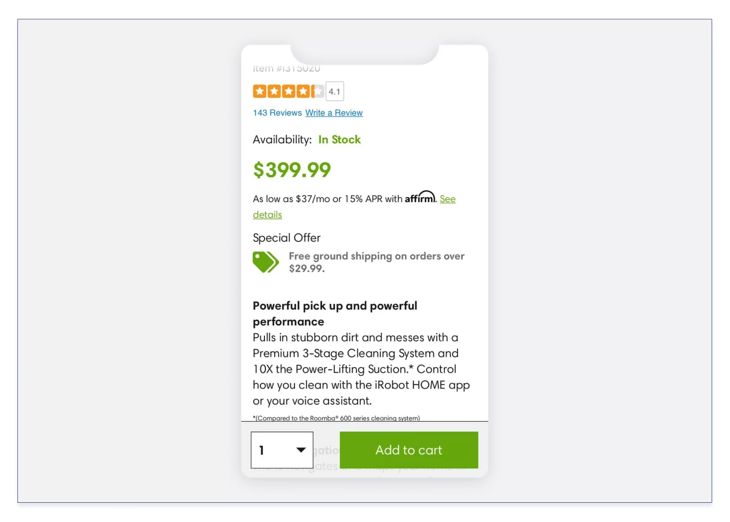
Source: https://www.irobot.com/
The mobile version of iRobot.com, the home robots manufacturer, has a sticky Add to Cart button: you scroll the product listing as you like but the button — which is large, attractive, and boosts up conversion by 8% — stays in the same place.
That’s where you need to turn up your focus on service full blast because the cart page is the breeding ground for additional sales. Give incentives to the buyer for selecting your shop and emphasize the benefits the buyer will get from this purchase — the way they can save money, what this product can be bundled with, where the promo code can be entered, and how quickly the product will be delivered.
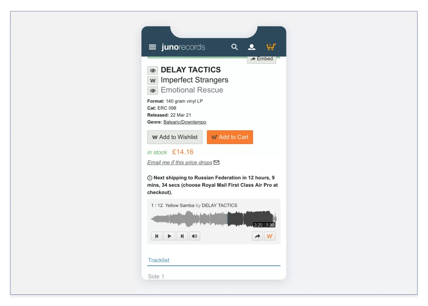
Source: https://www.juno.co.uk/
A product listing in Juno shop. Before buying an LP, you can listen to a fragment. Besides, there is time to think — the next delivery will be in 12 hours.
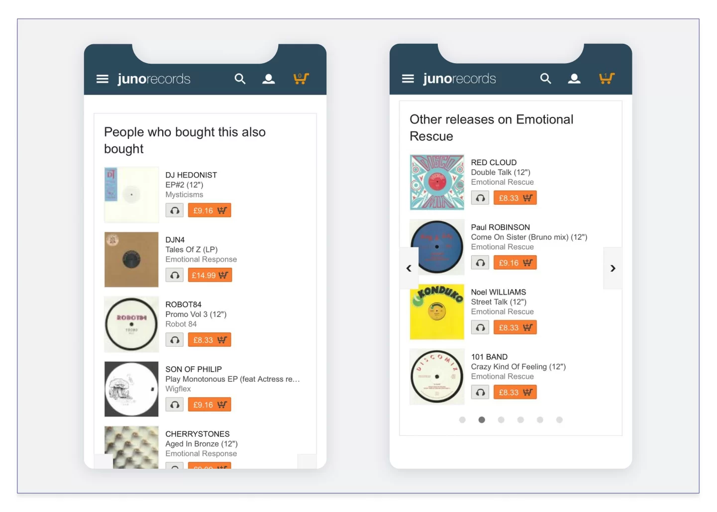
Source: https://www.juno.co.uk/
And while there’s still time left you can explore the music bought by other people who chose this LP, as well as find other interesting items issued by the record label.
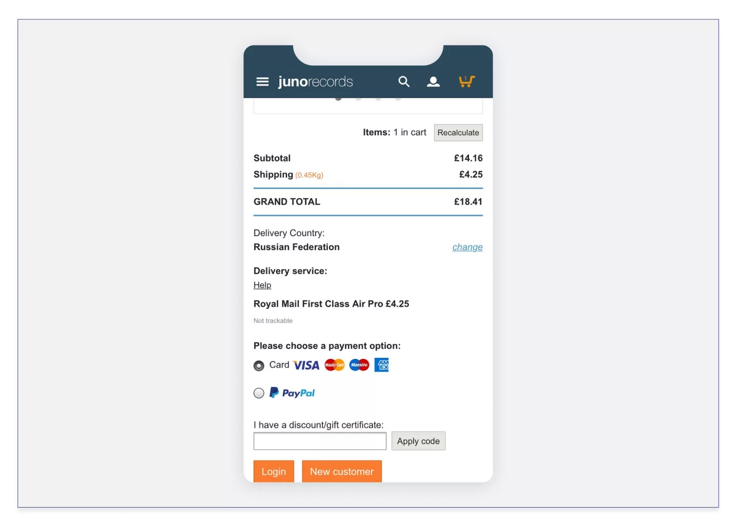
Source: https://www.juno.co.uk/
Offer several payment options (card payment, QR code, cash, installments) and delivery options (first class, delivery, pickup). Show the final amount including all discounts and extra charges for delivery.
How to start a successful online store. Part 6
Implement video shopping
The realities of ecommerce business urge online stores to provide tools to examine the product remotely. Video content and shopping assisted by this content have been developing and coming into common use for many years — this can be proved by Amazon Live and shopping in Instagram stories. However, video shopping is now offered as an individual service. Bambuser can be used as an example. A visitor of the Bambuser online store can request a real-time video recording of the product, chat, like, and place the product in the cart without interrupting the stream.
There are users who like various activities encouraged by the shop. On the other hand, some of them are encouraged by the mere fact that their opinion and content will be of decisive importance for another buyer.
Shoploop application created by Area 120, Google’s experimental research division, plays on this. Its users can shoot 90-second videos, including video reviews of purchased products. However, this is essentially the influencer marketing we are going to talk about in another post.
Creating an online store. Part 7
Keep voice assistant in mind
Though voice assistants are not exactly related to web design, it’s hard to ignore them. Alexa by Google, Siri by Apple, Alice by Yandex — the robots are already in the midst of us. They unload call centers in times of crisis, help us to find gifts on holiday eve, resume shopping if the buyer’s activity on the site was suddenly interrupted, ask clarifying questions if the buyer’s request turns out to be too complicated, turn a conversation into written communication using the voice-recognition technology and provide this information to the human operator.
The above-mentioned assistants are the most popular. These third-party applications of major companies may become a link between your website and the buyer on the condition that the site is correctly adapted for operation with this technology.
Perform technical optimization. First of all, provide an adaptive design for all standard screen sizes, high download speed (AMP pages will be of use), correct robots.txt, and a detailed product snippet.
Optimize the content for voice search. Add interrogative sentences and colloquial speech to your website texts because people use plain everyday language to ask the assistant a question and search for what they need.
Conclusion
As predicted by specialists, ecommerce revenue will be worth $476 billion in the U.S. Just imagine the scope of competition, especially considering that the major traffic is taken by such companies as Amazon and Aliexpress. You have no room for errors here: if you are going to use somebody’s practices, make sure that they are time-proven and best-in-class. If you want to implement new original practices, rely on audience behavior analysis, specific use cases, and thought-out marketing support. We hope our post has given you an understanding of what a competitive and efficient ecommerce store should look like.